Professional Networking Event Platform | Full UX Design Process – Case Study
Role: Product Designer/UX Designer & Researcher/Brand Designer
Tools: Figma, FigJam, Miro, Adobe Illustrator, Adobe Photoshop
Problem Statement
Traditional networking events can be difficult to manage and attend. Event organizers struggle with outreach and engagement, while attendees face challenges in discovering relevant events and making valuable connections. Gatherly aims to solve these issues by offering an intuitive, user-friendly platform for seamless event planning and networking.
The Solution
Gatherly is a streamlined platform for professional networking events.
- For attendees: Browse by industry/interest, RSVP in seconds, and connect through curated suggestions.
- For organizers: Create events with intuitive tools, flat-fee publishing, and built-in engagement analytics.
The Outcome
A clean, accessible experience designed to reduce event fatigue and make meaningful networking simple for both sides.
Research Summary
Approach
Competitive audit of platforms like Eventbrite and Meetup, evaluating UX, accessibility, navigation, pricing, and audience targeting.
Findings
- Eventbrite: strong visibility, but overly transactional.
- Meetup: supports communities, but weak onboarding and dated UX.
- Gaps across both: personalization, pre-event networking, and simple event creation.
Opportunities for Gatherly
- Cleaner, intuitive RSVP flow
- Personalized attendee recommendations
- Streamlined organizer dashboard with analytics
Impact
These insights shaped Gatherly’s user flows and features, positioning it as a more engaging, human-centered alternative.
Link to Competitive Audit PDF HERE
User Personas
To ensure Gatherly met user needs, two personas were created based on research:
1. Jordan Mitchell (Attendee Persona)
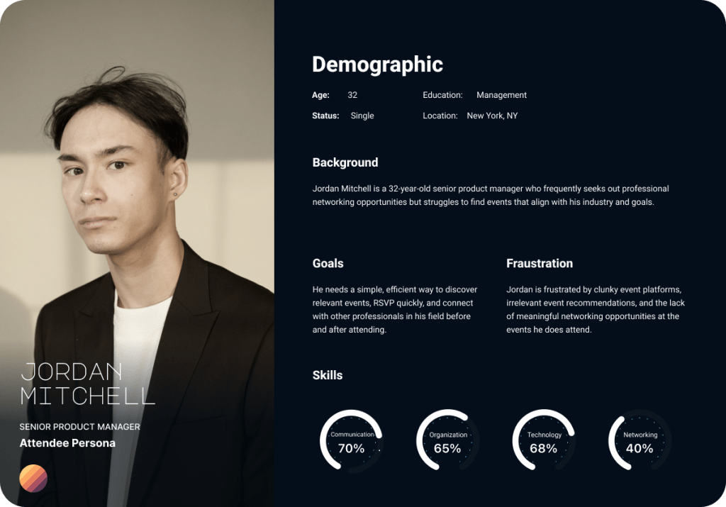
- Age: 32 | Job: Senior Product Manager | Pain Points: Hard to find relevant networking events.
- Needs: A streamlined way to RSVP and connect with other professionals.
2. Rachel Carter (Organizer Persona)

- Age: 27 | Job: Event Director | Pain Points: Struggles with event promotion and attendee engagement.
- Needs: A simple platform to create, manage, and track networking events.
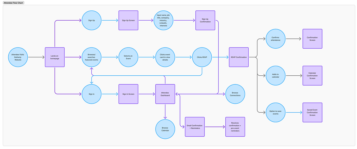
Task Flow & User Journey
Besed on User Persona needs and insights, I made a user task flow in FigJam to ensure a smooth user experience from event discovery to attendance.
The key flows include:
For Attendees:
• Browse Events – Users search for events based on industry, location, or format.
• RSVP & Profile Setup – Simple RSVP process with optional profile completion.
• Networking & Engagement – Attendees can connect with other guests before, during, and after the event.
• Event Attendance & Follow-Up – Users receive reminders and post-event materials.
For Organizers:
• Create an Event – Organizers fill in event details, add speakers, and set RSVP limits.
• Pay to Publish – A flat fee per event ensures accessibility while maintaining quality.
• Manage Attendees – Track RSVPs and engage with attendees.
• Event Analytics – View insights such as attendee engagement and event performance.

Information Architecture

I mapped Gatherly’s information architecture in FigJam to define clear user journeys for both attendees and organizers. By separating the two paths while keeping them visually connected, the flow ensures:
- Attendees can quickly browse events, RSVP, and connect with other professionals.
- Organizers can easily create, publish, and track events.
This structure allowed me to spot gaps early and ensure every screen supported a clear user goal, keeping the experience intuitive from the first click.
Design System & Brand Identity
& Logo Creation
Approach
Created a custom design system to ensure consistency, accessibility, and scalability across Gatherly’s interface. This guided decisions from typography to buttons, making the product feel polished and cohesive.
Key Elements
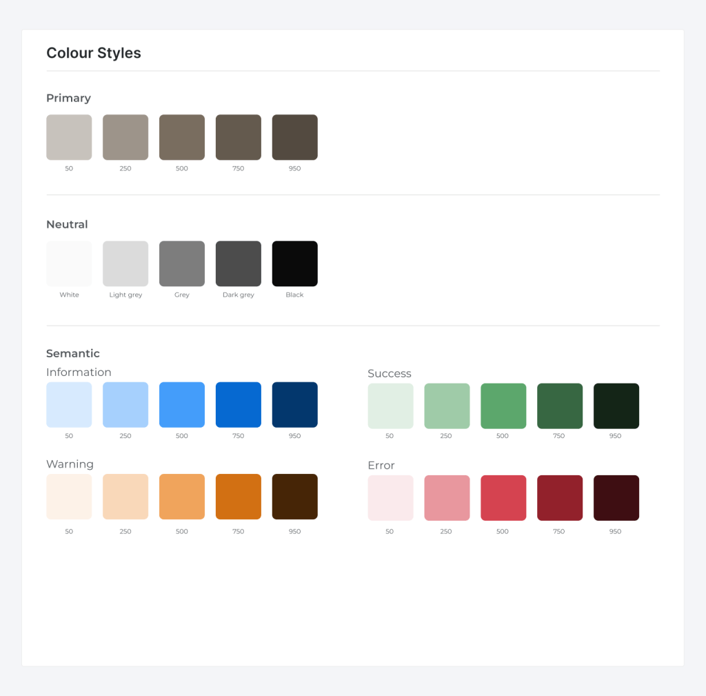
- Typography: Figtree for headings and Inter for body text, balancing hierarchy with readability.
- Color Palette: Semantic colors for information, success, warning, and error states to support clarity and accessibility.
- Iconography & Imagery: Minimal line icons and professional event visuals to reduce clutter and enhance navigation.
- Wordmark: Bold, geometric design reflecting structure and community—the core of Gatherly’s vision.
- Buttons: High-contrast with generous tap targets and subtle shadows to support users with visual or cognitive impairments.
Impact
This system streamlined design decisions, supported accessible interactions, and provided a strong foundation for high-fidelity prototypes.

Task Flow & User Journey
The task flow ensures a smooth user experience from event discovery to attendance. The key flows include:
For Attendees:
- Browse Events – Users search for events based on industry, location, or format.
- RSVP & Profile Setup – Simple RSVP process with optional profile completion.
- Networking & Engagement – Attendees can connect with other guests before, during, and after the event.
- Event Attendance & Follow-Up – Users receive reminders and post-event materials.
For Organizers:
- Create an Event – Organizers fill in event details, add speakers, and set RSVP limits.
- Pay to Publish – A flat fee per event ensures accessibility while maintaining quality.
- Manage Attendees – Track RSVPs and engage with attendees.
- Event Analytics – View insights such as attendee engagement and event performance.

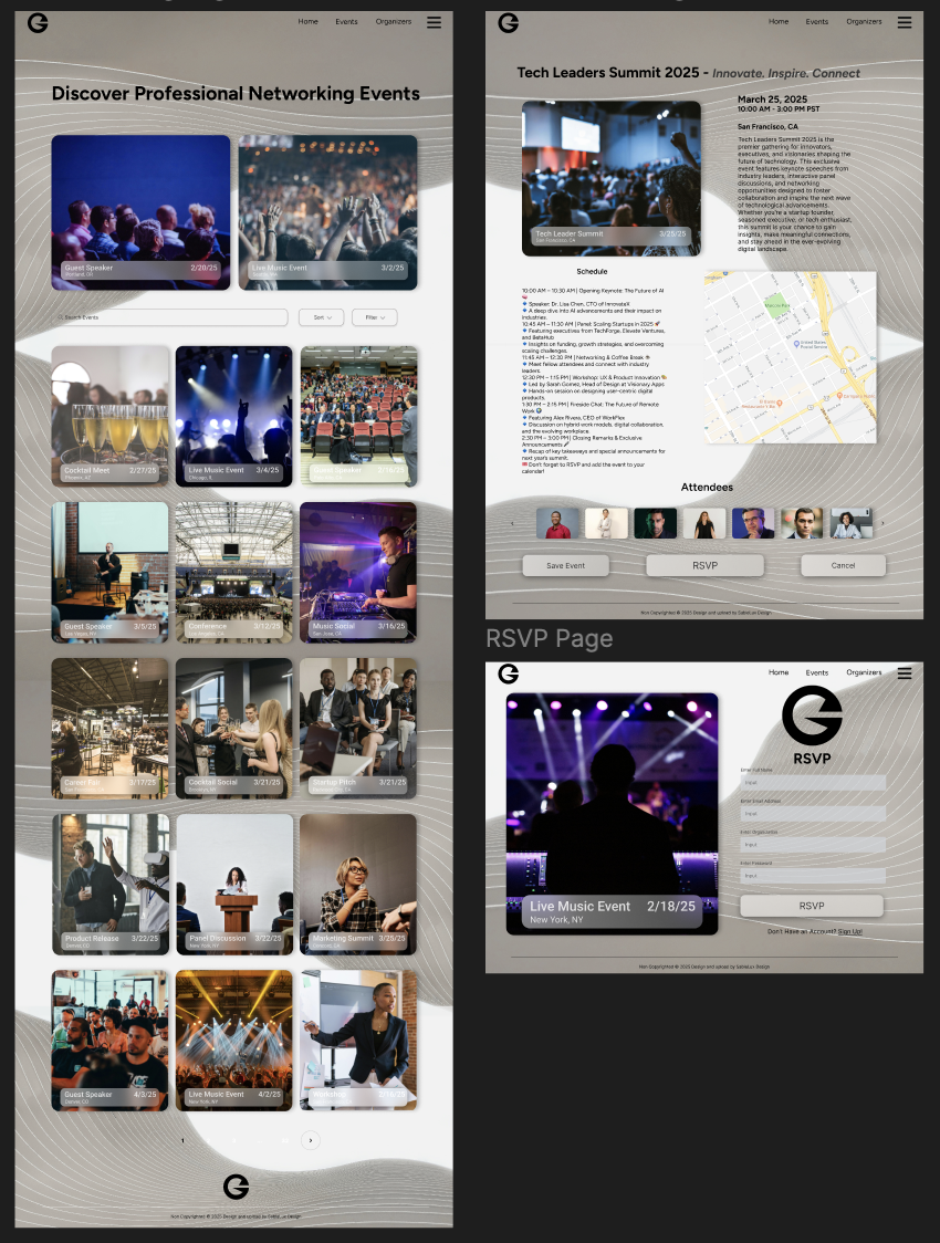
Wireframing & Prototyping
Low-fidelity wireframes were created in Figma to map out user flows before refining into high-fidelity designs. The wireframing process included:
- Homepage layout with clear navigation and CTA buttons.
- Event listing page featuring search filters and event cards.
- Event details page displaying speaker info, agenda, and RSVP options.
- User dashboards tailored for both attendees and organizers.
User Testing & Feedback
Approach
Moderated tests with 4 professionals (software engineer, marketing manager, entrepreneur, HR director) using a mid-fidelity prototype. Tasks covered event discovery, RSVP, pre-event prep, and organizer workflows. Findings were synthesized via affinity mapping.
User Testing Participants
- Michael – Software Engineer, 35
- Struggles with finding relevant tech networking events.
- Liked the clean UI but suggested better filtering options for event discovery.
- Emily – Marketing Manager, 29
- Frequently attends networking events but finds follow-ups challenging.
- Appreciated the built-in messaging feature for connecting with attendees post-event.
- Daniel – Entrepreneur, 42
- Hosts multiple events per year and needs a simple way to manage RSVPs.
- Suggested adding an attendee check-in feature for better event management.
- Sophia – HR Director, 38
- Attends HR-focused events and values structured networking.
- Recommended a “Featured Events” section to highlight industry-specific gatherings.
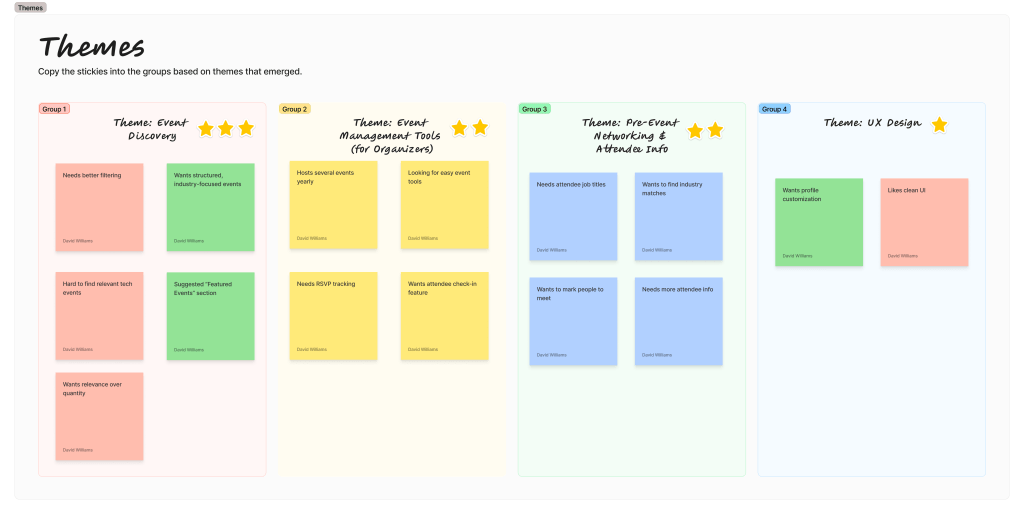
Usability Testing & Feedback
Approach
Moderated tests with 4 professionals (software engineer, marketing manager, entrepreneur, HR director) using a mid-fidelity prototype. Tasks covered event discovery, RSVP, pre-event prep, and organizer workflows. Findings were synthesized via affinity mapping.

Affinity Mapping Process
Key Findings
- Event relevance & filtering: Users need faster ways to narrow by industry, role, location, format, and keywords; a curated “Featured Events” area helps.
- Pre-event networking: Seeing attendee job titles/company/industry and the ability to mark people to meet increases perceived value.
- Organizer tools: Expect lightweight RSVP tracking, attendee check-in, and a clear, real-time dashboard.
- UX expectations: Clean UI, straightforward navigation, and transparent details build trust.
Design Decisions Implemented
Featured Events: Curated, industry-focused highlights on the homepage.
Advanced Filters: Added industry, job title, location, format, and keyword filters to speed discovery.
Attendee Profiles: Surfaced job title/company/industry + a “Mark to Meet” action for pre-event planning.
Organizer Dashboard: Introduced RSVP status, digital check-in, and simplified event creation steps.
High Fidelity Prototype & Takeaways
The final design delivers a clean, minimal interface informed by user research and testing. It prioritizes ease of use, relevant event discovery, and intuitive attendee previews for a seamless networking experience.
Key Takeaways
- Clarity & simplicity: Users preferred straightforward navigation and event flows.
- Customization & filtering: Essential for both event discovery and attendee lists.
- Organizer efficiency: Streamlined event creation and RSVP management were critical.
This project reinforced the value of designing with users throughout the process, ensuring solutions address real pain points rather than assumptions.


Personal Reflection
Project Scope & Firsts:
Gatherly was my first opportunity to take a product from concept to high-fidelity prototype, owning every step — from branding and wireframing to creating an interactive design system. This gave me a holistic view of how design decisions connect across the UX process.
Challenges & Growth:
There were moments of frustration and trial-and-error, especially when refining interactions based on user feedback. Those challenges taught me how to stay flexible, adapt quickly, and avoid getting too attached to early design ideas.
Key Learning:
The biggest takeaway was gaining confidence in making decisions backed by research rather than assumptions. Conducting usability testing, affinity mapping, and prioritizing feedback helped me build a product that felt intuitive for real users.
Personal Takeaway:
This project reminded me why I love UX — it’s not just about aesthetics, but about solving real problems in ways that feel natural and useful. I’m excited to carry these skills and insights into future projects, where I can continue designing with both empathy and precision.

