
Express Medical Collections
Medical Payments & Account Management Platform | UX/UI, Product Design
Team:
David Williams – Lead Designer | UX/UI · Product Strategy · Visual Systems
Angel Lin – Full-Stack Engineer
Tools:
Figma, FigJam, Illustrator
The Short
I led the design of a medical payment and account management platform that helps debtors clearly understand and manage their balances while giving administrators full visibility and control over complex cases.
I worked on this project as an in-house Lead Designer, responsible for shaping the end-to-end user experience of a dual-sided platform serving both debtors and internal admin/collector teams at Express Medical Collections. My work focused on creating a system that balanced usability, trust, and compliance within a highly regulated medical and financial context.
Key contributions included:
01
Product Design
Owned the UX/UI design for a multi-role payment platform, including debtor dashboards, payment flows, and admin case management tools.
02
System Thinking
Designed flexible payment options—one-time payments, payment plans, and autopay—while ensuring clarity, transparency, and compliance across user journeys.
03
Stakeholder Alignment
Collaborated closely with internal stakeholders to translate business requirements and regulatory constraints into intuitive, user-centered product experiences.
The Problem
How might we create a medical payment experience that reduces confusion and anxiety for debtors while enabling administrators to efficiently manage high-volume, high-complexity accounts?
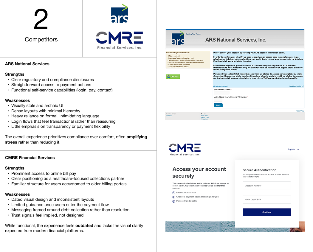
Market Landscape
To understand how medical debt collection platforms currently serve patients and account holders, I evaluated existing healthcare-focused collection experiences and identified where trust, clarity, and usability break down.
I focused primarily on ARS National Services and CMRE Financial Services, two established medical collections providers with active patient payment portals.
From The Field
To better understand the needs across both sides of the platform, I spoke with internal stakeholders and reviewed common user concerns surfaced through existing medical payment experiences. These conversations helped validate where current solutions fall short—and where thoughtful design could make a meaningful difference.
CEO — Express Medical Collections
Goals
- Maintain regulatory compliance while improving payment completion rates
- Reduce inbound support calls related to confusion or mistrust
Key Questions
- Where do users struggle most today?
- What does success look like for this platform?
Key Takeaway
“If users don’t trust the platform or understand their options, they hesitate to act. Clarity and credibility are just as important as functionality.”
Debtor — Hospital Billing Administrator
Goals
- Understand outstanding balances quickly
- Choose the right payment option without stress
- Feel confident entering sensitive financial information
Key Questions
- What’s frustrating about existing payment portals?
- What would make this process feel easier?
Key Takeaway
“I just want to know what I owe, what my options are, and that I’m in the right place. Other sites feel overwhelming and hard to navigate.”
Collector — EMC Collections Specialist
Goals
- Track multiple cases efficiently
- Understand account status at a glance
- Take quick action without jumping between systems
Key Questions
- What slows you down day to day?
- What information do you need immediately?
Key Takeaway
“The hardest part is managing volume. A clear dashboard with the right actions upfront makes a huge difference.”

Design Opportunities
Based on recurring insights from stakeholders and competitive analysis, I identified four core opportunity areas that would guide the platform’s design.
🔐 Trust First
Establish credibility immediately through calm color choices, familiar financial UI patterns, and clear security messaging —helping users feel confident they are in a legitimate, secure environment.
🧭 Clear Navigation
Reduce cognitive load with obvious paths forward and backward, including persistent “Back” and “Back Home” actions, so users always know where they are and how to recover.
💳 Flexible Payments
Support multiple payment methods—one-time payments, payment plans, and autopay—so users can choose what works best for their situation without pressure.
📊 Purposeful Dashboards
Design tailored dashboards for both debtors and collectors:
• Collectors manage cases efficiently with at-a-glance status, actions, and performance metrics
• Debtors see balances, options, and next steps clearly
Early Wireframes
To align early with stakeholders and reduce risk, I began the project by designing low-fidelity wireframes for the platform’s core experiences rather than jumping straight into high-fidelity UI.
These wireframes focused on structure, hierarchy, and flow—helping stakeholders validate functionality and requirements before visual complexity was introduced.


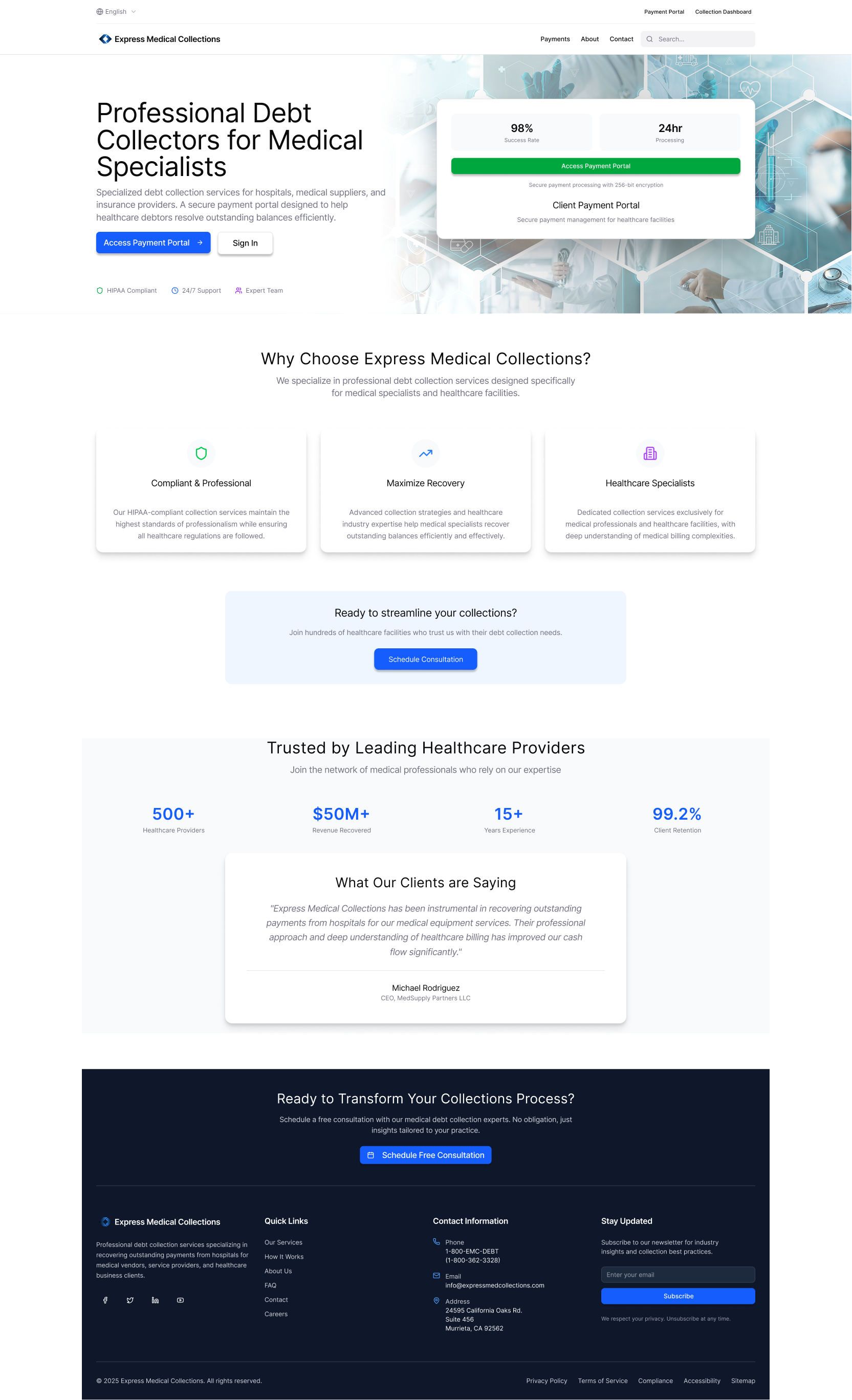
EMC Homepage
A clear entry point focused on reassurance, next steps, and access to payment options.
Payment Portal
A simplified layout prioritizing clarity, security cues, and flexibility between one-time payments, payment plans, and autopay.
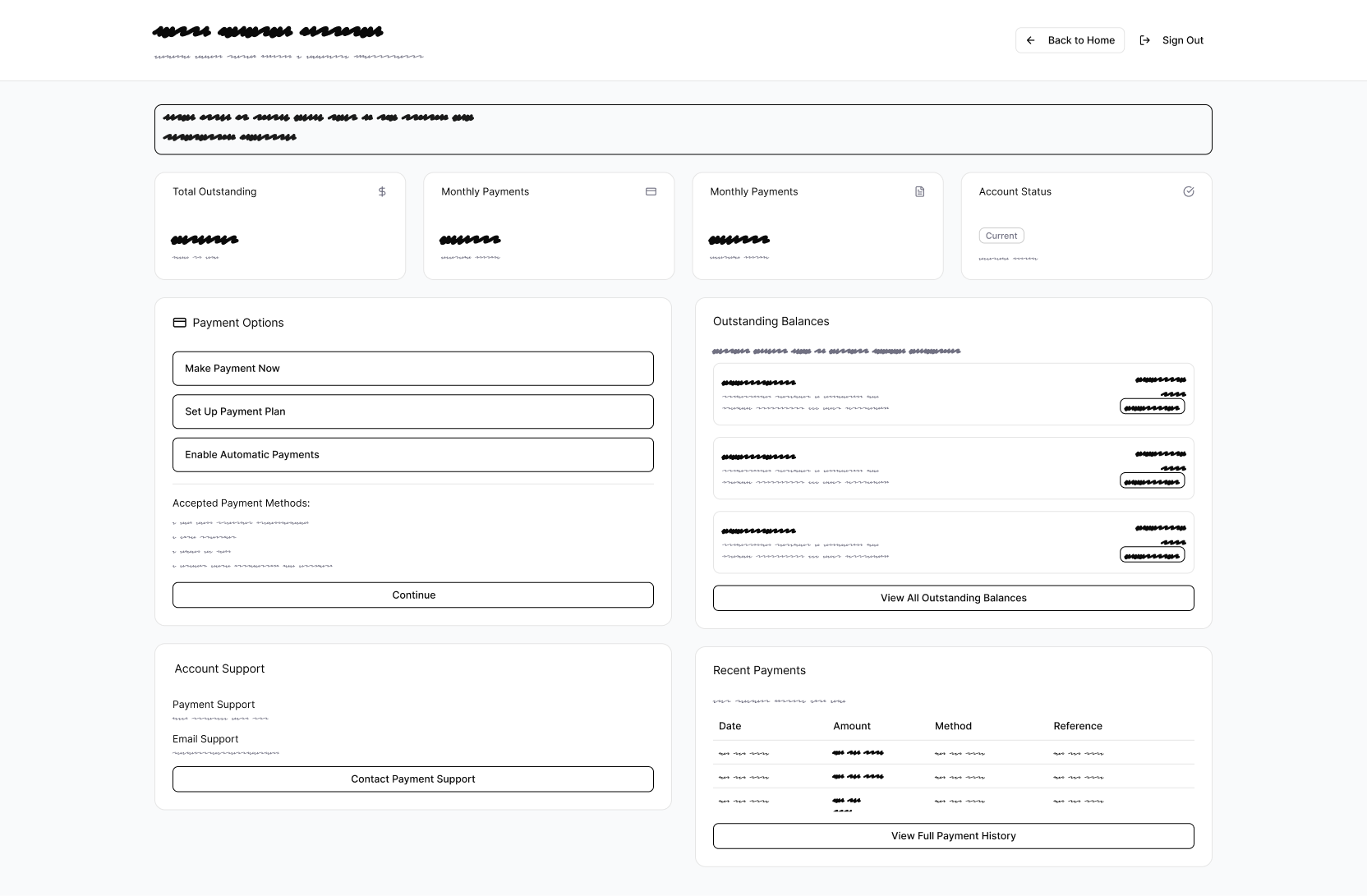

Debtor Dashboard
High-level visibility into balances, account status, and payment history, with obvious paths to action.
Collector Dashboard
A functional overview designed for speed—surfacing case status, actions, and performance metrics at a glance.
Design System
To support trust, clarity, and usability across a sensitive financial experience, I established a lightweight design system that balanced credibility with approachability.
Rather than over-engineering a full system, the goal was to define a clear visual foundation that could scale as the platform evolved.
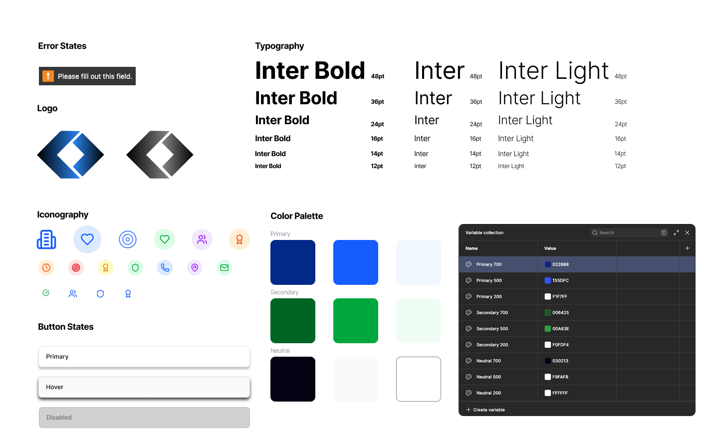
Color & Tone
The color palette centers on deep blues and supportive greens, drawing from familiar visual cues found in trusted banking and healthcare platforms.
- Blue reinforces security, professionalism, and reliability
- Green signals progress, success, and reassurance during payment actions
- Light neutrals help reduce visual noise and keep focus on critical information
This combination was intentionally chosen to soften the emotional weight often associated with medical billing and collections.
Typography
Inter was selected for its:
- High legibility across dense data layouts
- Neutral, modern tone suitable for financial contexts
- Strong hierarchy support from dashboard summaries to form inputs
Clear typographic scale helped users quickly scan balances, statuses, and actions without feeling overwhelmed.
Logo & Identity
The EMC logo was designed in Illustrator using a geometric, forward-leaning form to reflect structure, momentum, and resolution.
The angled shapes subtly suggest:
- Direction and progress
- Movement toward closure
- A modern take on financial stability
The mark avoids aggressive symbolism, reinforcing the idea that EMC is a partner in resolution, not just a collections entity.
UI Elements
Iconography, error states, and UI components were kept simple and consistent to:
- Reduce cognitive load
- Maintain clarity during high-stress moments
- Ensure accessibility and visual consistency across dashboards and payment flows
Iteration Exchange
The platform evolved through early iterations focused on improving trust, visual clarity, and modern appeal.


The first version established structure and messaging but felt visually reserved.
The refined iteration introduced stronger hierarchy, depth, and security cues—creating a more polished experience that better reflects EMC as a credible, modern healthcare payments partner.
Final Design
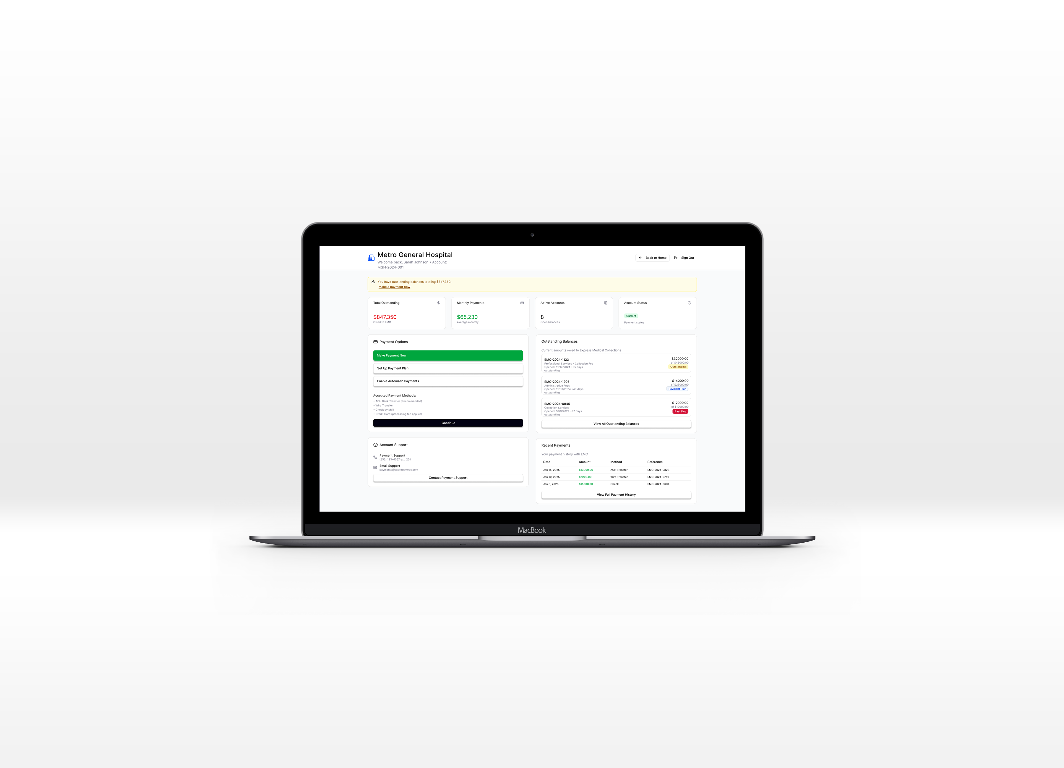
Debtor Flow
The debtor flow was designed to reduce anxiety and friction while guiding users toward clear, flexible payment actions.
From entry to completion, the experience prioritizes clarity, trust, and control, ensuring users always understand where they are, what they owe, and what options are available.
After landing on the homepage, the user has clear guided actions to Sign In or Sign Up. After login, users land on a clear dashboard showing balances, account status, and next steps, with immediate access to support and visible trust cues.
Payment Options
Flexible paths—one-time payments, payment plans, or autopay—are presented as distinct actions to reduce friction and confusion.
Payment Completion
The flow prioritizes transparency through clear fee breakdowns, familiar form patterns, and persistent Back and Back to Home navigation.
Outcome
A calm, understandable experience that respects the user while guiding them toward resolution.


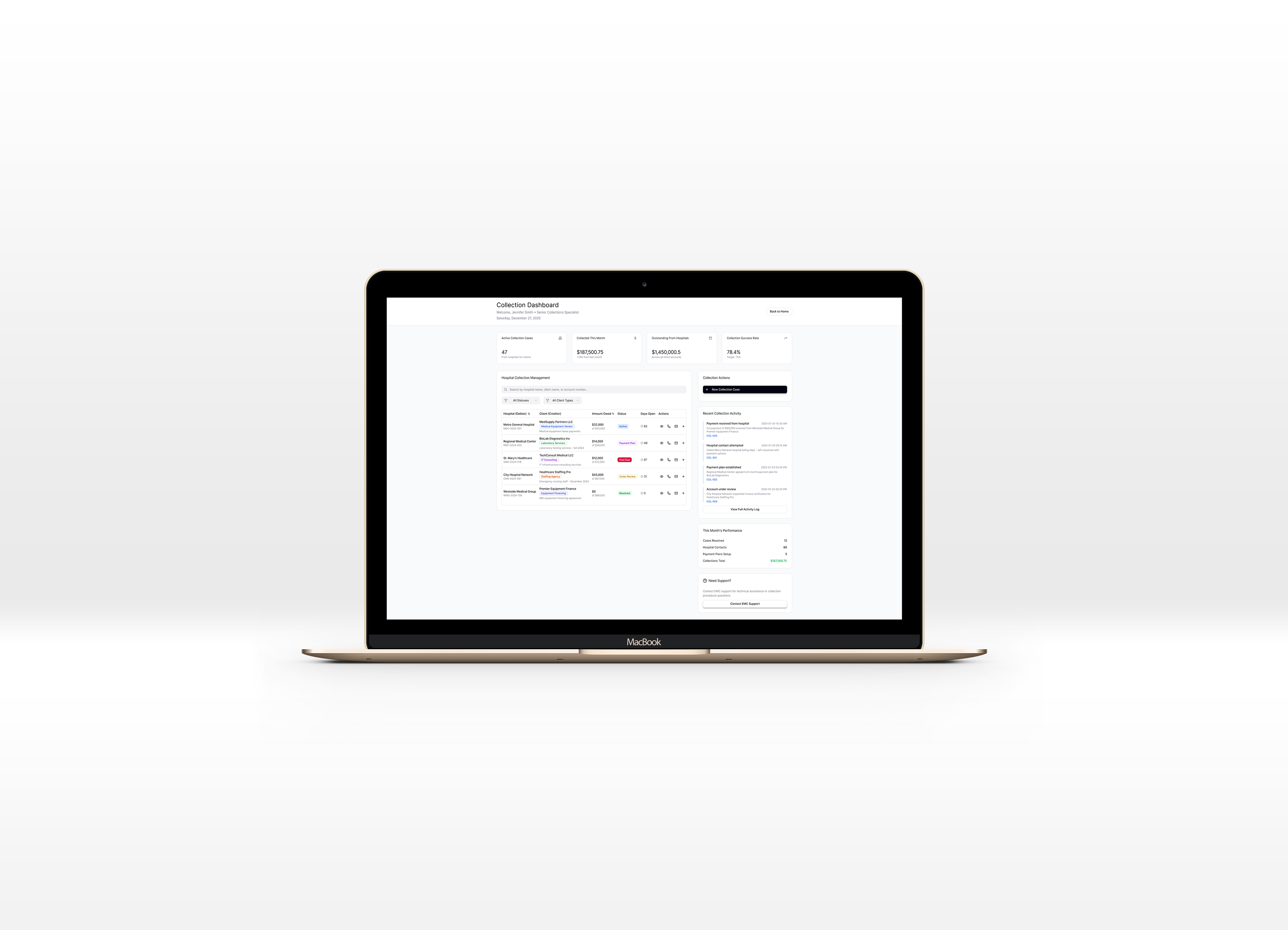
Collector Flow
The collection specialist flow was designed for speed, clarity, and scale—supporting high-volume case management without sacrificing visibility or control.
Collectors land on a centralized dashboard that surfaces active cases, outstanding balances, and performance metrics at a glance.
Case Management
Cases are organized in a clear, scannable table with quick access to key actions, reducing time spent navigating between screens.
Activity & Actions
Recent activity, account status changes, and collection actions are surfaced contextually, allowing specialists to respond quickly and stay focused.
Outcome
An efficient, purpose-built workflow that enables collectors to manage complexity confidently while maintaining operational momentum.
Consultation Flow
The consultation flow provides a clear off-ramp for users who need help beyond self-service.
Users can quickly request support from the dashboard or payment experience, select a preferred time, and submit their request without leaving the platform. The flow is intentionally lightweight—reducing friction while reinforcing that help is accessible and human.
A supportive, low-stress path that builds trust and prevents users from feeling blocked or abandoned during sensitive moments.
Final Thoughts
This project strengthened my ability to design calm, trustworthy experiences within complex and regulated systems.
🛡️
Designing for trust in high-stress contexts
Medical billing and collections require more than functional UI. Visual language, tone, and hierarchy play a critical role in reducing anxiety and helping users feel confident taking action.
🧭
Clarity beats complexity
Clear navigation, obvious recovery paths, and focused dashboards consistently outperformed more feature-heavy approaches. Simplicity proved essential for both debtors and collection specialists.
⚖️
Balancing business needs with user care
Working within strict compliance and operational constraints reinforced the importance of advocating for user clarity while still meeting business and regulatory requirements.
🤝
Early alignment prevents rework
Using wireframes to align with stakeholders early helped validate structure and flows before visual complexity was introduced—leading to smoother iteration and stronger final outcomes.
- Note: The EMC platform is currently in development. Success metrics will be defined and reported following the official product launch.
