Digital Investment Platform | Branding, UI, Motion Design
Role: Lead Designer — Brand Identity · UI/UX · Motion · Visual Systems
Tools: Figma, FigJam, Illustrator, Photoshop, After Effects
Arcadia is a concept investment platform that unifies finance management—stocks, crypto, and savings—into one modern experience.
The project explores how visual design, motion, and brand storytelling can make complex data feel intuitive, empowering, and human.
Meet Ethan

I created a persona to help guide my design decisions and inform Arcadia’s tone: streamlined, intelligent, and visually reassuring.
Ethan Parker, 32 — Tech-savvy, pragmatic, time-conscious investor seeking simplicity across multiple asset types.
Ethan’s Journey

Ethan’s journey highlights the need for a unified investment platform:
- Need: Wants a clear, consolidated view of his assets.
- Search: Looks for solutions that combine stocks, crypto, and savings.
- Onboard: Signs up and links accounts with minimal effort.
- Use: Checks his dashboard daily for balance, allocation, and performance trends.
- Manage: Reviews transactions and downloads reports with ease.
- Reflect: Feels more confident and in control of his financial health.
This journey illustrates how Arcadia reduces friction, shifting the user’s experience from disorganized and uncertain to streamlined and confident.
Information Architecture
I designed Arcadia’s information architecture to simplify complex financial data into a clear, intuitive system.
The structure prioritizes clarity, progressive disclosure, and logical navigation—guiding users from high-level portfolio insights down to detailed asset and transaction views without cognitive overload.
Each section is organized to support fast decision-making, scalability, and future feature growth while maintaining a calm, focused user experience.
Aesthetic Direction

I wanted Arcadia’s identity to balance clarity, trust, and sophistication, all important virtues in the finance industry.
The pyramid logo and gradient tones were created to symbolize focus and control, while the soft rose and deep navy palette evoke balance and confidence.
Typography pairs Goldman for strength with Inter for precision, creating a clean system adaptable across product and marketing.
Visual Strategy
Three key narratives were developed to define the campaign:
- Invest with confidence – Nature and balance.
- Redefine the way you invest – Control through technology.
- Your intelligent edge – AI meets human insight.
A story of balance, precision, and progress—where calm meets control, and human intuition meets intelligent design.
Design Ethos


I designed Arcadia’s landing page to feel immersive and intentional—each section moves with purpose. The visuals tell a story of empowerment, guiding users from data to discovery. Subtle motion, contrast, and light create a rhythm that reflects how confidence in design can translate to confidence in investment.
I used “Take Control” on the CTA button to evoke confidence and ownership, aligning with Arcadia’s mission to simplify and humanize finance.
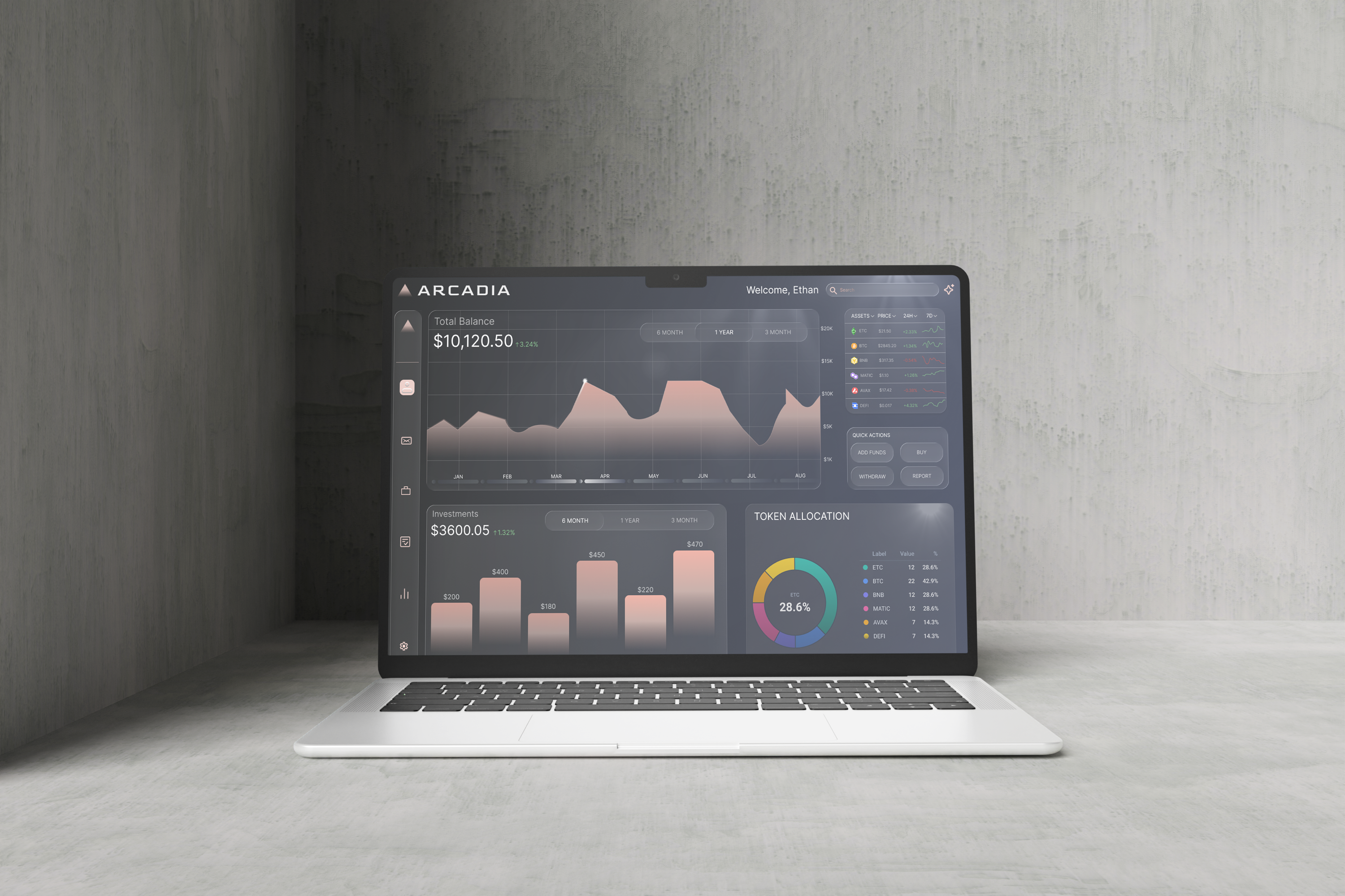
Data, Designed
I designed Arcadia’s interface to turn data into something felt, not just seen.
The dashboard was made to flow like a visual rhythm—clean, intuitive, and quietly confident. Each interaction reveals information with intention, letting users move through their finances with ease and focus rather than analysis fatigue.
Purpose, Defined
I wanted Arcadia to transform finance into feeling—where clarity meets emotion, and technology becomes human. Through visual rhythm, motion, and brand storytelling, I designed the experience to invite users to see their investments not as numbers, but as confidence in motion.
